Representing the four pillars of STEM (Science, Technology, Engineering, and Mathematics), the four uniquely colored lines intertwine, overlap, and come together to form the STEM Eagle, forming a symbol unique to both the wing and delta symbols of the United States Air and Space Forces, meant to uplift young minds and inspire future generations.
Scope of work consisted of establishing a new brand identity, guidelines, and full site design which can be found here: https://dafstem.us/
Client:
Department of Defense
Year:
2023
Services:
Design
Agency:
The Shipyard
Design Director:
Aris Bajar
The Dancing Coyote winery is located in Clarksburg, CA. As part of a new, natural, wine-making process that uses less additives, the winery asked un/common to help create a new brand to market these natural wines.
Known for the winery’s location along the misty California Delta, the name Lost Slough was created. The art direction and hand-drawn illustration style of the abstract reeds and wild grass was based off of the plant life that runs along the shoreline, and helps give each bottle it’s own unique style.
Client:
Dancing Coyote
Year:
2019
Services:
Art Direction, Illustration
Agency:
un/common
Design work for San Diego Tourism Authority highlighting the meetings and event space, showcasing the tech, climate, and innovation fields that America’s brightest city has to offer. Work includes print, digital, and campaign guide layouts.
Client:
San Diego Tourism
Year:
2023
Services:
Design
Agency:
The Shipyard
Art Director:
Brendan Rice
Copywriter:
Schuyler Vanden Bergh
With less cars on the road due to the pandemic, people were driving faster than ever, and accidents were worse. Rather than the friendlier messaging of GoSafely, the Office of Traffic Safety needed a more pointed message, one that would relate to a more teen-driven audience.
“Slow the Fast Down” may have been a bit unconventional for the state, but it’s message resonated with the public and traffic agencies alike. In addition, boards had targeted messaging along various freeways and highways throughout California.
Client:
California Office of Traffic Safety
Year:
2020
Services:
Art Direction
Agency:
un/common
Copywriter:
Josh Chilton
Video Editor:
Jason Rico
Due to the pandemic, ridership on Bay Area public transit was down heavily. The Bay Area Air Quality Management district tasked un/common with creating a fun and engaging way to get riders excited about getting back on public transit, while also helping to Spare the Air and opting for a “Car-Free Commute”.
Client:
Bay Area Air Quality Management
Year:
2021
Services:
Art Direction
Agency:
un/common
Video Editor:
Jason Rico
Copywriter:
Josh Chilton
Creative work for Visit Napa Valley
Client:
Visit Napa Valley
Year:
2022
Services:
Design
Agency:
The Shipyard
Design Director:
Aris Bajar
Branding work for California Pomegrantes
Client:
California Pomegranates
Year:
2023-Present
Services:
Design
Design work for Sky River Casino
Client:
Sky River
Year:
2022
Services:
Design
Agency:
The Shipyard
Design Director:
Aris Bajar
Creative Director:
Melissa Webber
Photo Based:
Moving away from the animated look of the original GoSafely, the client began to gravitate towards a photo-driven approach. Fonts and colors help keep the new style within the established GoSafely brand.
Animated:
The original version of GoSafely used animated assets as a friendly approach to traffic safety combined with headlines to give a wink and a smile.
Client:
California Office of Traffic Safety
Year:
2020-Present
Services:
Art Direction
Agency:
un/common
Creative Directors:
Brantley Payne/ Amber Witzke
Copywriter:
Josh Chilton
With their sleek design, Luxer One needed help pushing sales for their customizable lockers. An overall brand refresh was done to help push the idea that every “ONE”; from the employees, building managers, families, and manufacturers; that interact with these lockers counts.
Utilizing the locker as a texture itself helped ensure it found an engaging way to interact with imagery in each piece without feeling too forced.
Client:
Luxer One
Year:
2020
Services:
Art Direction
Agency:
un/common
Creative Director:
Brantley Payne
Copywriter:
Brantley Payne, Josh Chilton
Video Editor:
Jason Rico
Sacramento Municipal Utility District (SMUD) was making a big commitment to go completely Carbon-Free by the year 2030.
The following was a proposed campaign concept showcasing the idea of “promising power” and a “promising future” coming together as one to help not only Sacramento’s economy, but future generations as well.
Client:
SMUD
Year:
2021
Services:
Art Direction
Agency:
un/common
Copywriter:
Josh Chilton
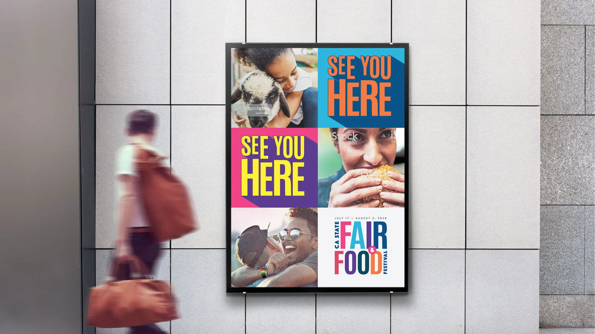
A proposed idea for the 2020 California State Fair. Bright colors and imagery were meant to help show the diverse make-up of California. “See YOU Here” was also a play on words to not only see you at the fair, but also see yourself represented as well.
Client:
California State Fair
Year:
2020
Services:
Art Direction
Agency:
un/common
With 3 days until a print-deadline, the Golden 1 Center was in a pinch and needed custom art for the upcoming Jonas Brothers show to display throughout the arena. It may have been a loooooong weekend but the end result were some amazing hand-drawn illustrations of the band that the client and myself are incredibly proud of.
Client:
Golden 1 Center
Year:
2019
Services:
Art Direction/ Illustration
Agency:
un/common
Client:
Tahoe Blue Vodka
Year:
2019
Services:
Package Design
Agency:
un/common
Creative Director:
Brantley Payne
Associate Creative Director:
David Hadley
A few examples of freelance work for the California Fig Advisory, expanding on already established branding; including design and layout for a 160 page cookbook.
Client:
California Fig Advisory Board
Year:
2019-Present
Services:
Design/ Layout
A few examples of hand drawn illustrations/ passion-projects centered around pop culture, entertainment, and of course horror movies.
“Clean Machine” character designs were based off of rough client design recommendations to help give a little extra brand identity to a chain of laundromats.